Glo Branding Project
Project Overview
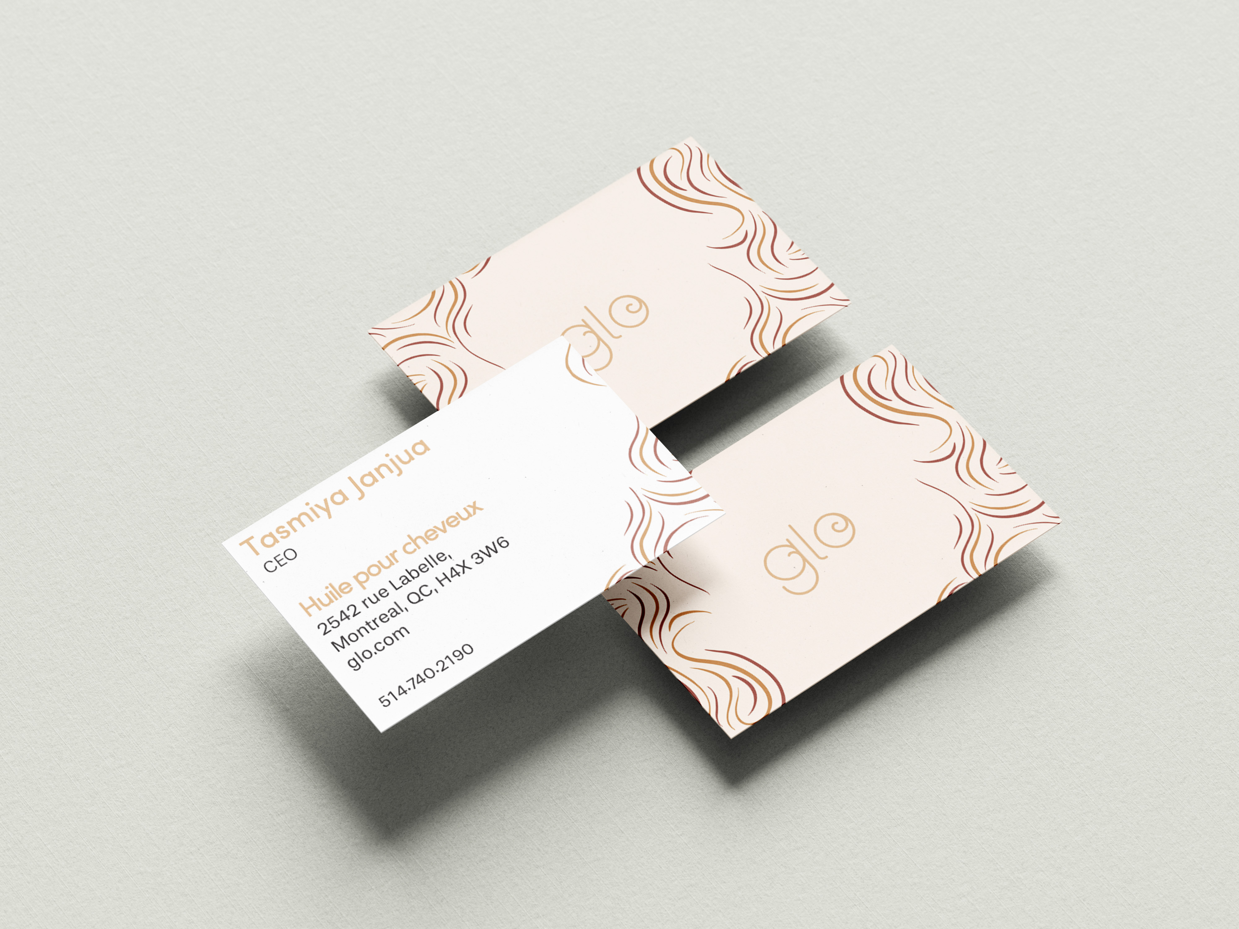
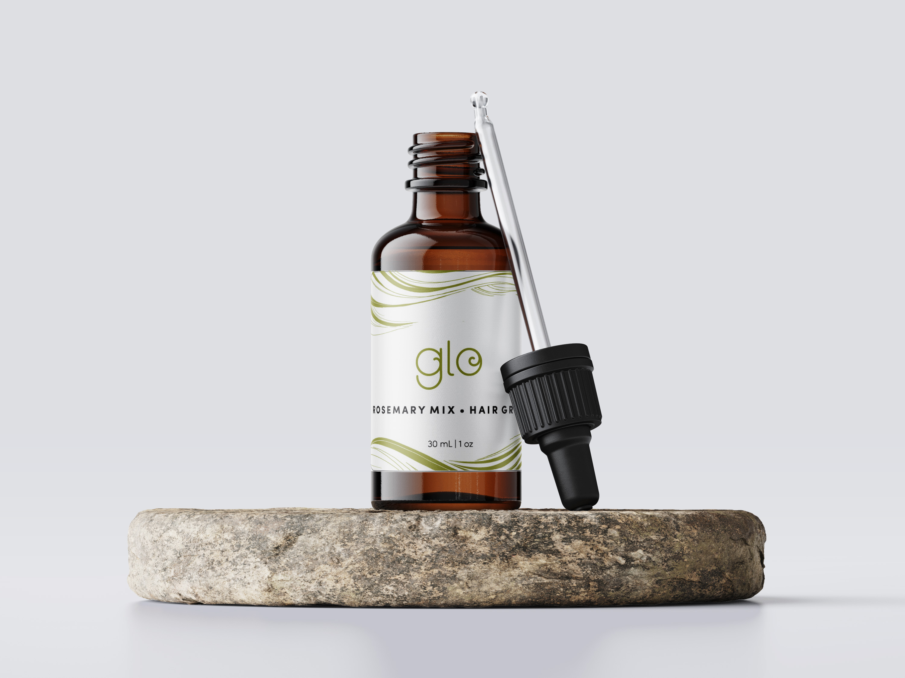
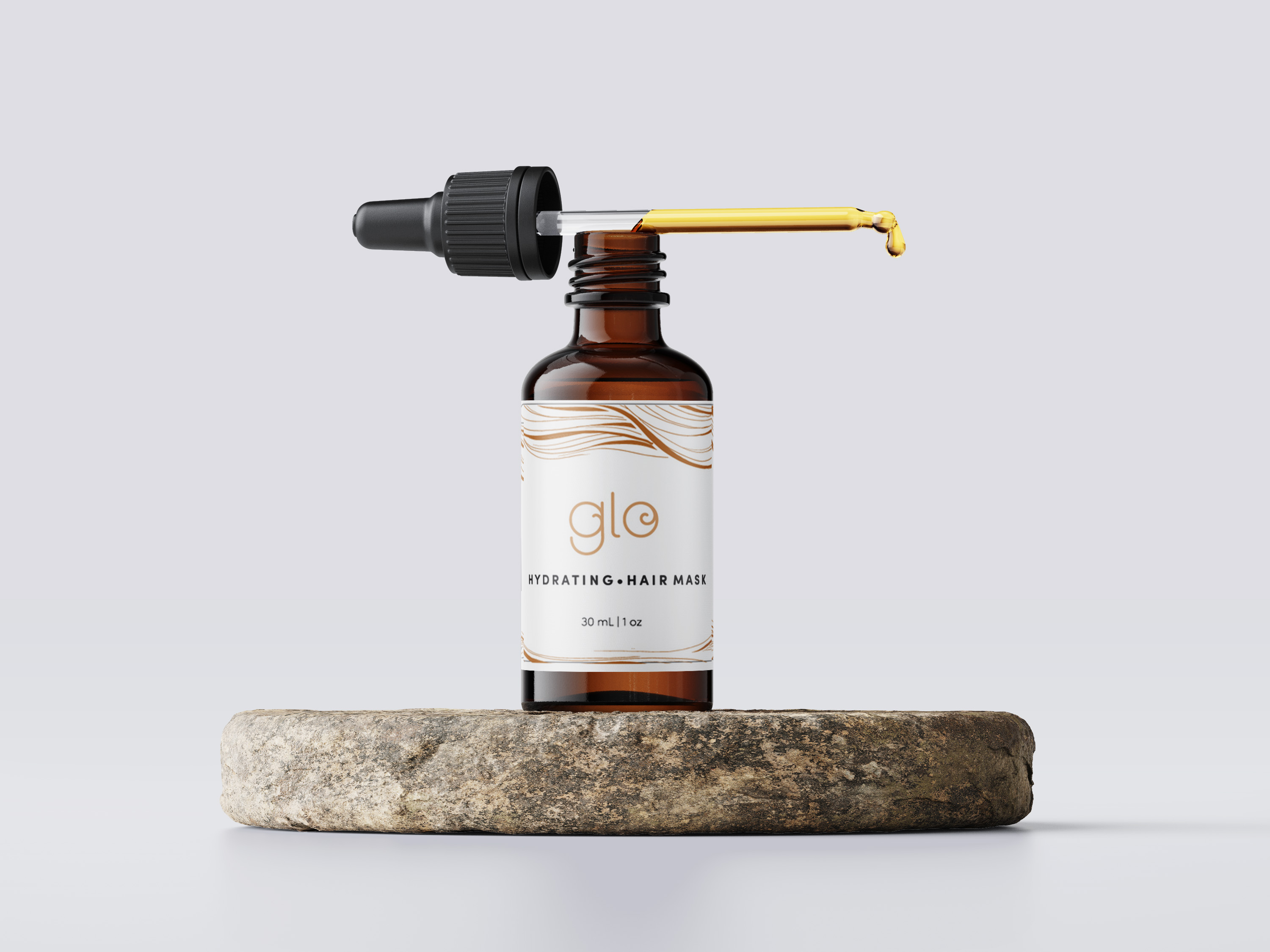
For my Glo branding project, I was tasked with creating the logo, business card, and packaging for their hair oil bottles. The brand is focused on natural beauty, and I wanted the design to reflect that essence.
Logo Design
The logo is simple and elegant, featuring a swirl inside the “o” that mimics the flow of hair. This subtle design element ties in the product’s theme of hair care while maintaining a clean and sophisticated look. I wanted to keep the design minimal but meaningful, emphasizing natural beauty through the flow of the swirl.
Color Palette
The color scheme is natural and neutral, consisting of earthy tones like gold, brown, and green. These colors convey a sense of calm, luxury, and organic beauty, which align perfectly with the brand’s mission of delivering high-quality, nature-inspired hair care products.
Business Card and Packaging Design
For the business card and packaging, I created a pattern made up of strokes that resemble hair. The strokes are subtle, but they bring a unique, artistic touch to the overall design. The packaging design has a clean and professional feel, with the strokes adding texture and interest without overwhelming the brand’s natural aesthetic.
Conclusion
Overall, the Glo branding project was about creating something that felt sophisticated yet grounded, minimal yet with just the right amount of creative flair. The design elements, from the logo to the business card and packaging, all work together to reflect the brand’s commitment to natural beauty and high-quality hair care.


